Meet our new logo
March 26, 2019
Medallia Culture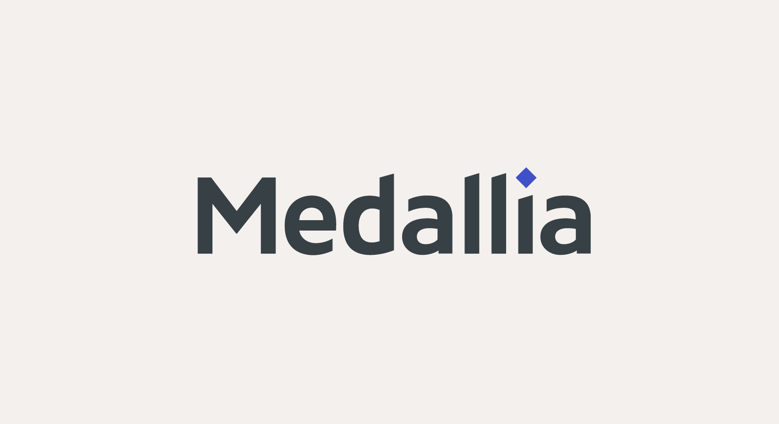
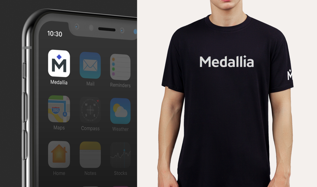
Hello there. Today we’re excited to share a new chapter in our brand’s story — the redesign of Medallia’s logo.
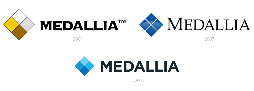
Let’s start with a quick trip down logo memory lane.
In 2001, the Medallia name was born out of the notion of a medal — an award that’s received for performance, victory, and excellence in customer experience. To represent that achievement our co-founders created a diamond with four metallic colors. Over the years our logo has been modernized, but the diamond has endured.
Fast forward to 2019, Medallia is the #1 Experience Management platform, trusted by the world’s leading brands. Our customers win by focusing on experience excellence. Medallia helps create great products, employee experiences, and customer experiences — which ultimately creates great brands.
So with this logo refresh, our diamond stays but with an enhanced meaning. We began to think of our diamond as the north star — a beacon that acts as a guide for companies redefining the way they create experiences.
Going forward, you’ll see the diamond become a more prominent element within our design system as a North Star.
Along with redefining the diamond, we’re changing our brand colors. We call our new primary color Medallia indigo.
The simplicity of one primary color rather than our previous four blues allows the brand to be more bold and ensures consistency of appearance wherever you see our logo.
In the coming months, you’ll see the new brand system be integrated into everything we do — our product, website, and Experience conference. We’re still the Medallia you love, but bolder and looking forward even further ahead to help you win. Here’s to building the world’s best brands together.
