9 UX Design Best Practices and Ideas for Banking Websites
July 7, 2020
Digital Experience
User experience (UX) plays a vital role in a company’s success. Businesses that invest in UX see an increase in revenue and customer loyalty. Customers who have a positive experience are apt to spend 140% more than customers who have a negative experience. They’re also six times more likely to explore the company’s other products, twice as likely to purchase from them again, and four times more likely to leave positive reviews.
UX has a far-reaching impact. A customer’s first impression of a company sets the tone for the rest of their relationship with that brand. Customer experience (CX) affects buying decisions, determines brand loyalty, and influences their customer lifetime value (CLV), or the amount of money they’ll give to a business in their lifetime.
Not only can a negative experience damage a company’s reputation, but it can also cost the company money. New Voice Media conducted a study that determined $75 billion is lost by American businesses every year due to negative customer experiences. It’s easy to see that UX is critical for businesses wanting to increase revenue and improve return on investment (ROI).
9 Best Practices for Banking Websites
Modern technological advancements have brought significant change to the banking industry. Financial institutions can now use analytics to understand more about their customer base. Information like customer needs, behaviors, and pain points can help businesses create a more customized experience. Banks can now empower their customers to do more on their own with less effort. This gives people more control over their financial decisions.
Part of this consumer empowerment comes from banking’s online accessibility. Most businesses are strengthening their online presence, and the banking industry is no different. About 80% of consumers prefer to do their banking online. Not only is it convenient, but it’s also a significant source for customer retention. 82% of bank customers stay with their banks because of their online and mobile platforms. For these reasons, banks need to make UX a critical part of their digital marketing strategy.
Money management can be a confusing and overwhelming process. As consumers take on a more significant role in their financial decisions, they want a simple, intuitive, and seamless experience. They need confidence to ensure they’re making the best decisions about their money. Banking websites should follow these nine best practices to strengthen their relationship with current customers while gaining new business.
1. Create Obvious Links to Useful Pages
When visitors come to your website, they’ve arrived because they’re seeking information. Help them find answers quickly and efficiently. Determine which of your site’s pages contain valuable resources, then feature prominent links to those pages. Popular resources include branch locations, online banking login, and contact information. By simplifying the trajectory in locating information, the UX is greatly improved.
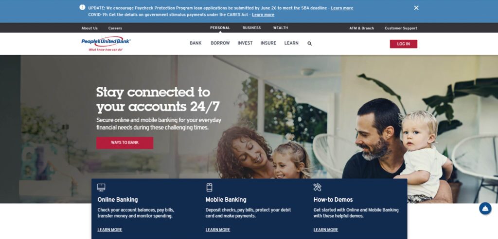
At the bottom of their home page, People’s United Bank provides prominent links to often-searched pages on their website. Visitors see them clearly and are quickly directed to the resources they need.
2. Promote User-Friendly Navigation
It’s not uncommon for visitors to land on a bank’s home page, log in to their account, and then walk away from the interaction. Develop a user-friendly navigation structure to entice visitors to investigate other areas of your site. You offer a variety of features to your customers. Help people discover these by employing expanding menus. Drive users to multiple levels within your site with the simple click of a mouse.
A demographic shift is occurring among banking customers. Millennials will soon be the largest client group for the banking industry. This younger audience has a different set of expectations when it comes to online UX. A recent Gallup poll found that Millenials change their primary bank 2.5 times more often than other age groups. This is due to their need for an easy and simplified UX. If a site’s navigation isn’t intuitive, they move on to another bank.
3. Design for Mobile Applications
Business is no longer conducted strictly from stationary sources. In fact, up to 70% of web traffic comes from a mobile device. When it comes to banking, more than 90% of Americans check their account balance remotely. For these reasons, websites need to provide a web design that enables visitors to access information from any device.
People want to conduct business on the go, and a website that isn’t conducive to this provides a frustrating customer experience. Mobile-friendly websites and mobile banking apps offer many benefits to consumers and financial institutions. Don’t lose business simply because your website isn’t formatted for a variety of platforms.
4. Create Useful Content
Careful content development is especially crucial for financial websites. By offering useful tools and resources on your website, customers are empowered to make informed decisions about their money.
Content should be well-written with wording that is easy to understand. Break up large amounts of text with shorter paragraphs that are simple to digest. Make sure the information provided offers value to the customer. Keep your customers’ needs in mind and provide answers, solutions, and relevant information. This will engage your readers and lead to higher conversion rates.
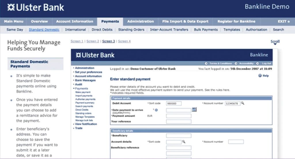
On their user interface, Ulster Bank does a great job of offering valuable information in manageable sections. By using bullet points, they provide a list of steps that are easy for customers to follow.
5. Keep it Simple
Website layout is an integral part of the user experience. A recent study showed that 38% of people would stop engaging with a website if the layout isn’t appealing. Financial calculations can be complicated enough. There’s no need to add more confusion to the self-banking process with a complicated platform.
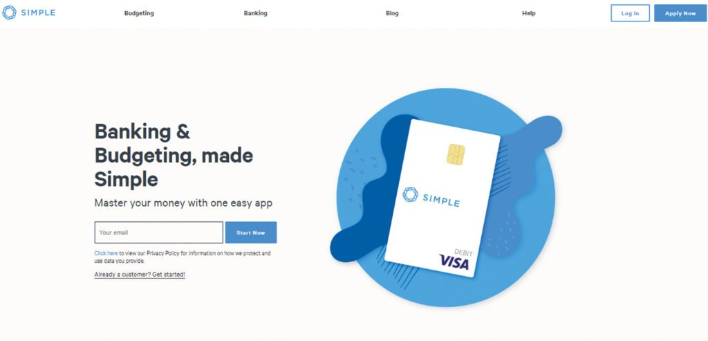
Simplicity is key. Banking sites are removing clutter and eliminating unnecessary information. This allows visitors to focus on the essential elements of their customer journey. Simple Banking aims to make banking as easy as possible. Their website reflects this philosophy with a clean layout. No extraneous information and lots of white space make it easy to spot the pertinent information on the site.
6. Be Consistent
People are creatures of habit. When they know what to expect, their fears are allayed. Consistency is key to gaining trust and building confidence. A consistent presentation of a brand can increase revenue by 33%. Ensure that your website’s design is in line with your brand’s image.
Everything about your business should be instantly recognizable. From your brick-and-mortar locations and email communications to your website layout, be sure to maintain visual consistency. This strengthens your brand identity and helps people recall your business.
Additionally, ensure that your web layout is consistent in the way it displays information. Customers should know where to find certain information each time they visit your site. By shortening the learning curve and saving customers time in locating pertinent material, you’re providing a better UX.
7. Offer Clear CTAs
You don’t want people to simply visit your website. You want them to take action. Encourage them to do so by including a clear call-to-action (CTA) button (and link within the content) on each page of your website. Give people a defined direction like “Apply Now” or “Sign Up Here.” Not only are these ADA compliant, but they’re also easy for a user to identify as they scan the page. Make the process easy by helping users and channeling conversions.
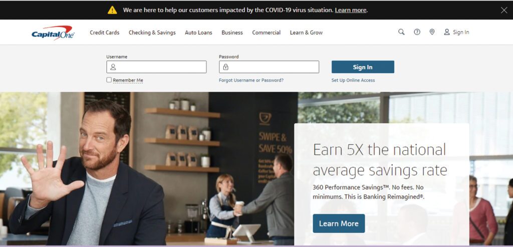
Capital One offers a variety of clear CTA buttons on their home page. By using a contrasting color consistently on the site, the buttons stand out on the page and are easy for customers to recognize.
8. Provide Clear Signposts to Customer Support
When it comes to managing their money, people want to make careful decisions and are concerned about making mistakes. It’s not uncommon for visitors to have questions during this process. Provide a variety of ways for customers to reach you.
Offer an obvious link to your Customer Services and Contact Us pages. Offer Live Chat and phone number information so people can get answers right away. Consider providing a FAQ page that might answer general questions at a glance. The more resources you give your viewers, the more confident they’ll be in doing business with you. This is another way to provide an excellent UX.
9. Utilize Digital Experience Analytics
It’s essential to understand the intentions and online behavior of your users to design experiences they will love. Tracking details like bounce rate, decisions made in a customer’s journey, and material searched can help you understand what about your website is working and what isn’t. This information is critical to creating a positive UX that yields results.
Technologies like Medallia Digital Experience Analytics exist to automatically pinpoint poor user experiences and give digital teams the insights they need to fix them. The team at Fidelity International, for instance, used Medallia Digital Experience Analytics to identify and solve user frustration on their log in page, resulting in complete ROI from week one.
Follow a Simple Process for Transforming User Experiences
Enterprises face unique challenges when it comes to measuring and improving experiences on websites and apps. It takes a clearcut process to navigate those obstacles and create user experiences that drive conversions, engagement, and loyalty.
Download The Essential Tools of Digital Experience Analytics to discover the place for each tool in your digital experience strategy, and how to get the most out of them to maximize actionable insights.

